The Power of Web Design: the Perfect Design

- Introduction
- Importance of web design
- The basics of web design
- Design elements
- Design principles
- Choosing the right design for your website
- Understanding your audience
- Defining your brand
- Establishing your goals
- Components of an effective website layout
- Navigation
- Content
- Responsiveness
- Trends in web design
- Flat design
- Material design
- Micro-animations
- Best practices for web design
- 1. Keeping it simple
- 2. Improving the user experience (UX)
- 3. Testing and iteration
- Conclusion
- Recap of key points
- Final thoughts
- Call to action
Introduction
Web development is crucial to every part of our lives nowadays. Given the countless new websites popping up every day, it’s more important than ever to have one that’s well-designed and sticks out from the crowd. Many customers’ first impressions of a business are formed after visiting its website. In order to ensure its success, it must be user-friendly and attractive.
Importance of web design
A well-designed website is important for many reasons. Its first impression on site visitors is crucial. If your website is poorly made, potential customers will have a bad first impression of your business and what it has to offer.
Yet if your site is well-designed, it can boost your company’s reputation. It’s important because the way people use your website affects how much money you make online.
The basics of web design
The term “web design” refers to the process of developing a website‘s visual style. Web design is the process of putting a website’s visual elements (like images and text) in the best way for users to see and move around the site. Graphic design, user experience design, and content planning are just a few of the many fields that come together to form web design.
Design elements
When making a website that works, there are a number of important design factors that shouldn’t be forgotten. Color, typeface, and images are all examples of such aspects.
Color
Web designers frequently rely on color as a primary or secondary design element. Good web design does a lot to improve the look of a website and the reputation of a brand. Colors can also affect how people feel and what they do when they visit a website. Examples of warm colors that can do this are red, orange, and yellow, whereas examples of cool colors that can do the same include blue, green, and purple.
Typography
Typography is the art and science of designing and setting type to make text easier to read, easier to understand, and look better. It’s a must-have in web design because of how important it is to the site’s visual hierarchy. The perfect typeface can do wonders for your brand’s voice and the readability of your content.
Imagery
Images are an important part of any design because they have a big impact on how a website looks as a whole. It can help express a message, set the tone, and break up huge blocks of text. Websites with high-quality images are far more enjoyable to browse.
Design principles
The term “design principles” is used to describe the underlying ideas in the design process. A well-designed website must adhere to a number of fundamental design principles. Such elements include proximity, contrast, and equilibrium.
Balance
Visual balance is achieved when pieces are evenly spaced around the composition. In the world of design, both symmetrical balance and asymmetrical balance are valid ways to achieve balance. Visual elements are symmetrically balanced when they are placed in the same way on both sides of a central axis. On the other hand, asymmetrically balanced elements are placed in a way that makes them balance each other even though they are not in the same place.
Contrast
The contrast of a design is its brightness contrast and blackness contrast. It is an important design guideline since it helps create visual appeal and makes components stand out. High contrast can be used to draw attention to certain parts of a design, while low contrast can give the impression of peace and harmony.
Proximity
The term “proximity” is used to describe the relationship between two things that are physically close together. By sticking to this basic idea of design, visual groups are made and the overall structure of the design is improved. By putting similar things close to each other, you can emphasize how close they are and give the impression that they belong together.
Choosing the right design for your website
Your website’s success depends on the design you choose for it. Several things, like your target demographic, brand identity, and project objectives, must be taken into account before settling on a final design.
Understanding your audience
When it comes to making design decisions for your website, knowing your audience is essential. The age, gender, level of education, and interests of your prospective customers are just some of the demographic factors you should think about. You can use this information to make smart decisions about the visual parts of your design, like the color scheme, typeface, and artwork.
Defining your brand
Choosing your brand is another important step in choosing the best design for your website. Everything about you—your goals, your values, your character traits, and your particular abilities—makes up your brand. It is important to build a website that accurately represents your brand and communicates your brand’s values to the people you want to reach.
Establishing your goals
Finding the best layout for your website requires first determining its purpose. The best kinds of goals are the ones that are SMART (specific, measurable, attainable, relevant, and time-bound). Most websites have the same general goals, like getting more visitors, getting more leads, and getting their customers more involved. All of your design decisions ought to be in service of those objectives.
You can build a design for your website that satisfies the demands of your target audience, reflects your brand, and helps you achieve your goals if you first take the time to learn about them, then define your brand, and lastly set your goals.
Components of an effective website layout
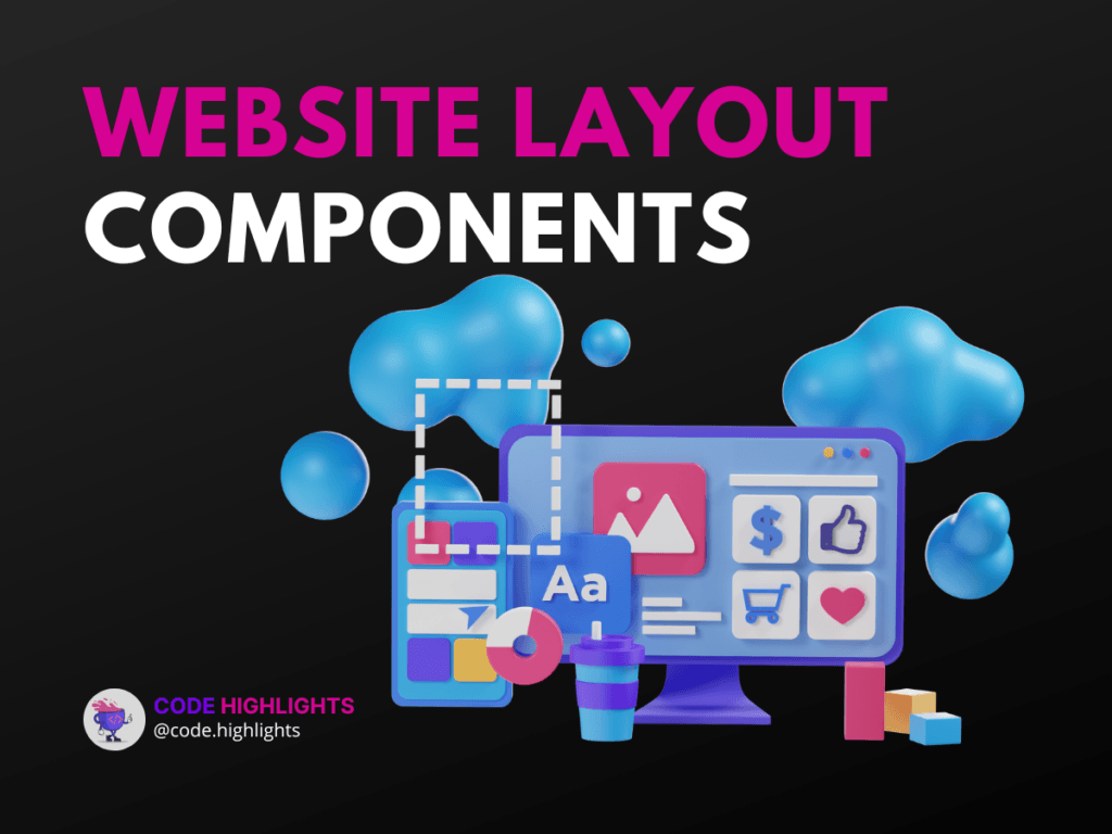
A good layout for a website is one that does what it’s supposed to do and is fun to use. Several crucial components of a website’s design are required for this to occur. Among these components are:
Navigation
Website navigation is the process through which visitors locate desired content. It provides navigational aids such as menus, links, and other tools. The interface must be straightforward and simple to use, with labels that are clear and concise.
Menu structure
A website’s menu structure is the hierarchical organization of its various menu options. It should make sense to the user and make it easy to get to the content they want quickly. A website’s user experience and retention rates can both benefit from a well-organized menu.
Search functionality
Websites must have a search bar to be useful. Users can easily find the content they want by typing a word or phrase into a search bar. The search features need to be built into the layout in a way that makes sense.
Content
The content of a website refers to the material displayed there. It includes text, images, videos, and other types of media. This content must be perfect in terms of being correct, up-to-date, and well-organized. It should also be optimized for search engines and be easy to read on a variety of devices.
Organization
The term “organization” is used to describe the method by which a website’s information is structured. There should be a distinct visual hierarchy that facilitates navigation and comprehension. Users will have a better time and be able to discover the information they need faster if the site is well organized.
Quality
Quality in web design is measured by how carefully every element is crafted. It takes into account things like font, picture, and general style. Design elements of high quality may do wonders for a website, both for the user experience and the first impression visitors get.
Responsiveness
What we mean when we talk about responsiveness is a website’s capability of resizing itself to fit the display of a user’s chosen device. A website with a responsive design will display and perform properly across multiple devices. As more and more people rely on mobile devices to surf the web, this feature has become crucial to the success of any website.
By adding these features to the design, you can make your website easy for people to use, nice to look at, and good for search engines. This can make your users happier, get them more involved, and help you reach your goals.
Trends in web design
As time passes, new styles and approaches arise in web design. The following are some current trends in website design:
Flat design
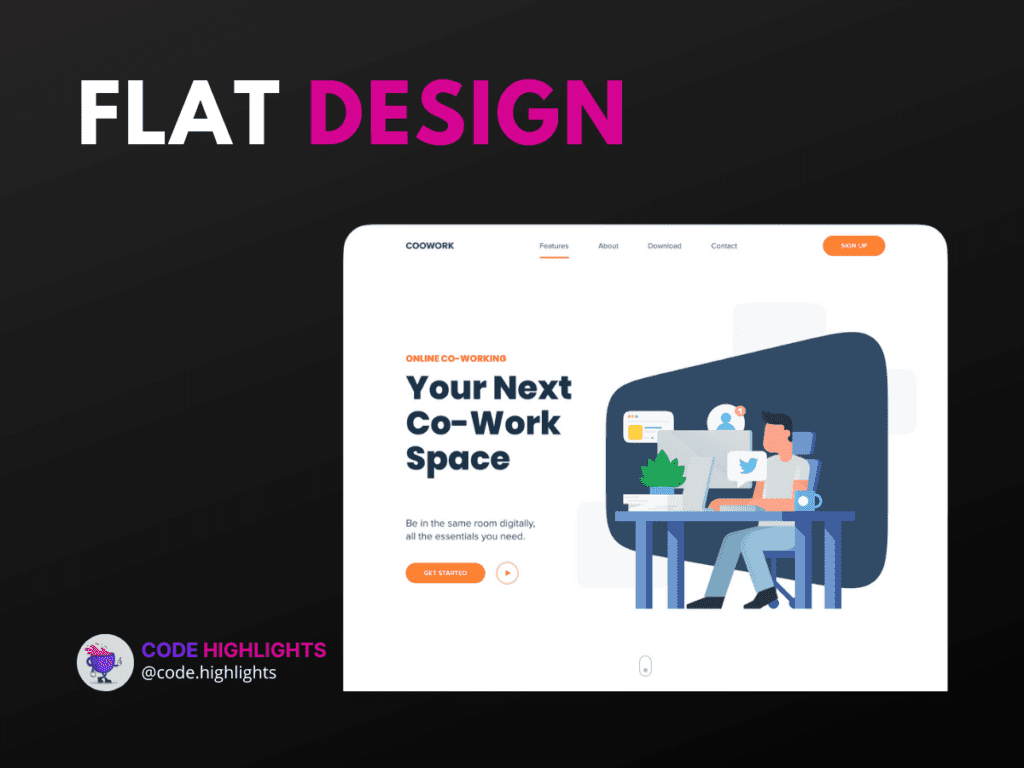
Flat design is a way of making websites and other digital media that focuses on simplicity and clarity. It’s sleek and contemporary because of the two-dimensional artwork and restricted color palette. Flat design’s benefits include a more pleasing aesthetic, simplicity, and speed. Some people might find it boring and too simple, and it might not have enough different things to look at.
Here is a good example of a flat design: skylead.io
Material design
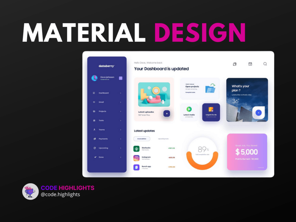
Material Design is a unified way of making things look that combines flat graphics with shadows to make them look like they have depth. Material design has advantages like looking better than flat design while still being simple and easy to understand. Some websites may not be able to use it because of its potential for complexity in implementation.
Micro-animations
Micro-movements are delicate, imperceptible animations that improve a website’s usability. You can use them to let users know what’s going on, show what state something is in, or just make things look prettier. Micro-animations have a lot of benefits, such as making the user experience better, giving users feedback, and making the site look better. Cons include the fact that if they are used too frequently, they can cause the site to slow down and be distracting.
It’s important to choose a trend that speaks to your target market’s needs and helps your brand stand out. It’s vital to weigh the benefits and drawbacks of each trend before committing to one, as what works well for one website may not work well for another.
In conclusion, web design trends can bring in new ideas and improve the way a website works and how the user feels about it as a whole. It is important to choose the right trend for your needs and implement it in a way that makes your website better instead of worse.
Best practices for web design
If a website is going to be successful, it needs to stick to web design best practices. Some of the most important guidelines to follow include the following:
1. Keeping it simple
Simplicity is the ultimate sophistication when it comes to web design. That’s why it’s crucial to keep things simple, employ a straightforward design, and put the most relevant content where users can find it without any hassle.
2. Improving the user experience (UX)
One of the most vital components of any website is the user experience. This involves making sure your website is user-friendly in terms of navigation, structure, and content delivery.
3. Testing and iteration
Website success depends heavily on testing and iteration. To make sure your website is meeting your goals and giving users the best experience possible, you should test it regularly to find any bugs or places where it could be better. Then, you can make changes and iterate on the design.
If you build your website according to these rules, you can be sure that your target audience will find it useful and easy to use. Whether you’re building a site for yourself or your company, following these guidelines will ensure that you end up with a site that looks good and does what you need it to.
Conclusion
Finally, web design is crucial to the development of a functional website. Web design basics include knowing about colors, fonts, images, and the design ideas of balance, contrast, and proximity. Think about who you’re designing for, what you hope to accomplish with the site, and how you want people to interact with it.
A well-designed website will have easy-to-use menus and search tools, well-organized and high-quality content, and a user interface that adjusts to the user’s device. Web design trends like flat design, material design, and micro-animations can bring fresh perspectives to the table, but it is vital to pick the right trend for your project.
Follow web design best practices like minimalism, improving the user experience, testing, and iterating to make a website that works well and is easy to use.
Recap of key points
To sum up, web design is an important part of making a website that works well and is popular. You can make a site that is both good-looking and practical if you take the time to learn the fundamentals of web design, select a suitable layout for your content, and adhere to industry standards.
Final thoughts
Because of this, web designers must always be on the lookout for the next big thing. Make sure your website keeps up with the times by keeping abreast of industry developments and best practices and being open to fresh perspectives.
Call to action
It’s time to put what you’ve learned about web design and what makes a good website into practice. First, you need to decide what you hope to achieve, who you want to reach, and how you want your website to look. Then, you should follow best practices for web design and keep adding to and improving your site. With time and effort, you can build a site that meets your needs, appeals to your target audience, and moves you closer to your goals.
FAQs
What is the difference between web design and web development?
What is the difference between web design and web development?
Designing a website’s visual style and user interface is known as web design. A well-designed website looks good and is easy to use. This means that colors, fonts, images, and other design elements need to be chosen with care. Web development, on the other hand, is all about the coding and technical parts of making a website, like programming, database management, and server-side scripting.
How can I make my website responsive?
How can I make my website responsive?
A responsive website changes how it looks to fit the screen of any device. To make your website mobile-friendly, you need to use a responsive design framework and tweak the layout, font, and pictures. Your website should be tested on different devices to make sure it looks and works the way you want it to on all of them.
How do I choose the right design for my website?
How do I choose the right design for my website?
Think about who you want to visit your site, how you want them to feel when they do, and what you want to accomplish before you settle on a design. Consider the content you intend to post on your site and select a layout that works well with that type of material. Choose a design that is both modern and aesthetically pleasing for your website.
What is the purpose of web design?
What is the purpose of web design?
Making a website that is both aesthetically pleasing and functionally practical is what web designers strive for. Making a website that looks good and functions well is the goal of web design, which includes making decisions about things like the color palette, font, and picture.
Is it important to have a well-designed website?
Is it important to have a well-designed website?
Having a well-designed website is crucial. With a well-thought-out website, you can raise awareness of your brand, strengthen relationships with your target audience, and move closer to your goals. On the other hand, if your website isn’t well-designed, visitors may find it hard to use and may think less of your business because of it. Building relationships with your audience and accomplishing your goals online requires a well-designed website.
Stay Ahead with Code highlights
Join our community of forward-thinkers and innovators. Subscribe to get the latest updates on courses, exclusive insights, and tips from industry experts directly to your inbox.


Copyright © Code Highlights 2025.
